


25
Apr
Tips For Monitor Calibration
- By Gaurav Mittal
- No Comments
Monitor calibration allows your images to appear consistent across other monitors and viewing devices. it is also essential if you want colors on your prints to be accurate. Here are some tips on the types of software available and how to accurately calibrate your monitor.
Before you set out to edit your images, it’s important to make sure that you are viewing your images on a properly calibrated monitor. Your images should appear consistent across other monitors and viewing devices. Working on a monitor that has not been calibrated means that what you see on your monitor may not look the same on someone else’s monitor. This is also critical if you are planning on making prints, as it may result in a print mismatch.
To help calibrate your monitor and keep it accurate, various software and devices are available in the market. A device known as a colorimeter attaches to your monitor and, with the help of software, it goes through various steps and creates a custom ICC color profile for the specific monitor. This results in your images looking consistent across other monitors. Below, I walk you through the process, step by step so you can accurately calibrate your monitor.

In the photo above, you can see a calibration device attached to my monitor. I have been using the ColorMunki Display by X-rite for many years and am happy with it. There are other software and devices available, such as the Datacolor Spyder5PRO, that are equally good and can be similarly profiled. I do recommend that you go through the instruction manual for any software/device-specific requirements.
Tip #1 – Monitor Type and Gamma Settings
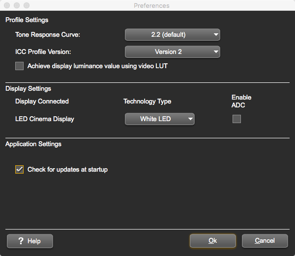
After installing the software, click the Launch ColorMunki Display tab. Under the main ColorMunki Display menu tab click the Preferences tab. Under Profile Settings, set the Tone Response Curve/Display Gamma to 2.2 and the ICC Profile Version to Version 2.
Display Gamma setting controls the rate at which shades appear to increase from black to white. A setting of 2.2 is now an industry standard for image editing and viewing; you should use this setting because it’s close to your display’s native setting. It also best correlates with how we perceive brightness variations.
Version 4 of the ICC specifications is the more recent version but Version 2 is generally more compatible with a wide range of software. Given that most working space profiles are version 2, most users should change the setting to Version 2.
Under Display Settings, select the appropriate Technology Type based on your monitor type. Since the calibration software detected my LED Cinema Display, I selected White LED from the drop-down tab.
Selecting the correct technology type is required for accurate color calibration. Most of the newer laptops and LED displays are white LED; this information can be found in the user manual.
Tip #2 – White Balance
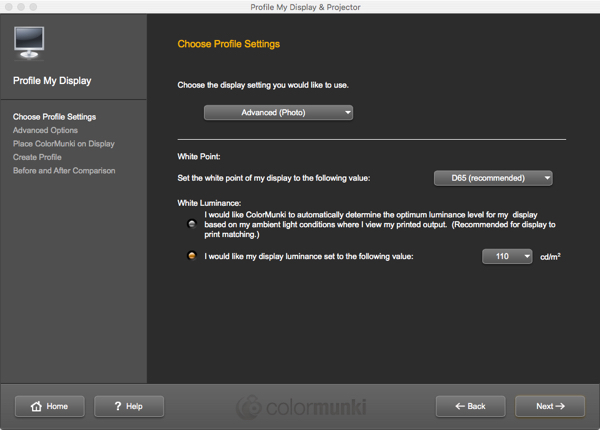
From the Choose Profile Settings, click the Profile My Display tab. Select Advanced for display settings and then set the White Point to medium white 6500 or D65.
As I have stated in the beginning, your images should appear consistent across other monitors and viewing devices. This is where setting the white point comes into play; we set this to match the white on the screen to the white on the material and the environment in which it will be viewed. One of the main reasons for selecting a white point of 6500K is because the color profile is sRGB, which is also aligned with a 6500K white point. This widely used color gamut is the standard for saving and viewing images online. Note that just as we set the white balance on our cameras where the sunlight setting ranges between 5000K and 6000K, our screens are mostly calibrated by default to a white point of 6500K.
For the purpose of printing, paper tends to have warmer white points so it is recommended to set the warmer 5000K as your base point.
Tip #3 – Luminescence Setting
Now the Luminescence to 110. I recommend that you try the luminance setting in the range of 90 to 110 and adjust the brightness level according to your taste.
Luminescence or brightness of the monitor is the most important setting for screen-to-print matching. The brightness of the monitor is driven to a large degree by the brightness of the working environment. The brighter the working environment, the brighter the monitor must be. The brightness level should be based on what is comfortable to your eye and suits your workflow and your ambient lighting. That is the reason to have a range so you can adjust to your needs. One key reason to keep the Luminescence setting within this range will allow your prints to match what you see on your monitor.
Tip #4 – Color Calibration and Profile Naming
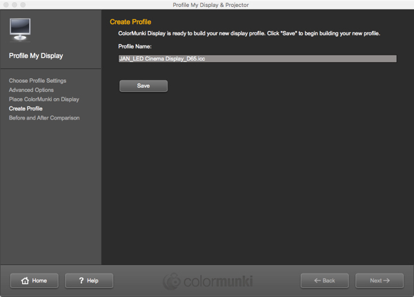
The calibration process takes approximately four to five minutes. Once finished, you’ll be prompted to name and then save the profile. I recommend naming the new ICC profile by the date or month in which you have created it. This is a good way to remember when you are due for another calibration.
Tip #5 – Visual Check Before and After
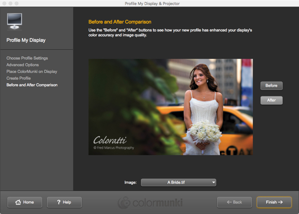
The final step is to see the Before and After results, once the software and the colorimeter have finished calibrating. By selecting the Before and After tab on the software screen, you’ll notice a marked difference in colors and brightness levels of the image. Your monitor is now calibrated and ready to take on any image-editing job.
It’s safe to say that the software you are using for calibrating your monitor automatically enables the new ICC profile it has generated for you. It is, however, advisable to check the display settings and be a 100% sure.
Color calibration takes just a few moments and dramatically improves your images.
Submit a Comment